
Visual identity for a comprehensive pediatric practice: warm, trustworthy and close, without losing professionalism.
Care that inspires trust.
MIO needed an identity that conveyed warmth and closeness for families, while keeping medical seriousness. We designed a flexible brand, with a friendly color system and variants for every context, from the clinic to the street.
The logo and its variants.
A full-color version and its usage systems, to ensure legibility and coherence across any medium.


Palette and typography.
A warm, human system: oranges and amber, a wine and a raspberry, teal greens and petrol, plus a secondary support palette.
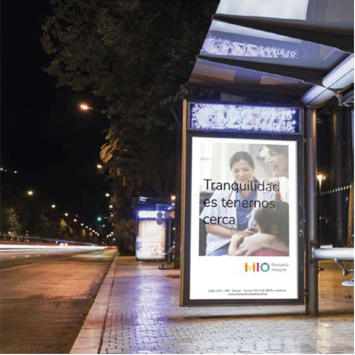
The brand in the real world.
Social media, medical uniform, appointment app and out-of-home.
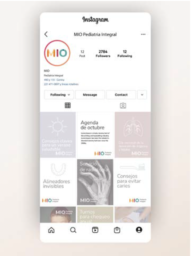


A brand families recognize and trust.
MIO gained a coherent, warm presence at every touchpoint —from the clinic to the street— reinforcing its promise: peace of mind is having us close.